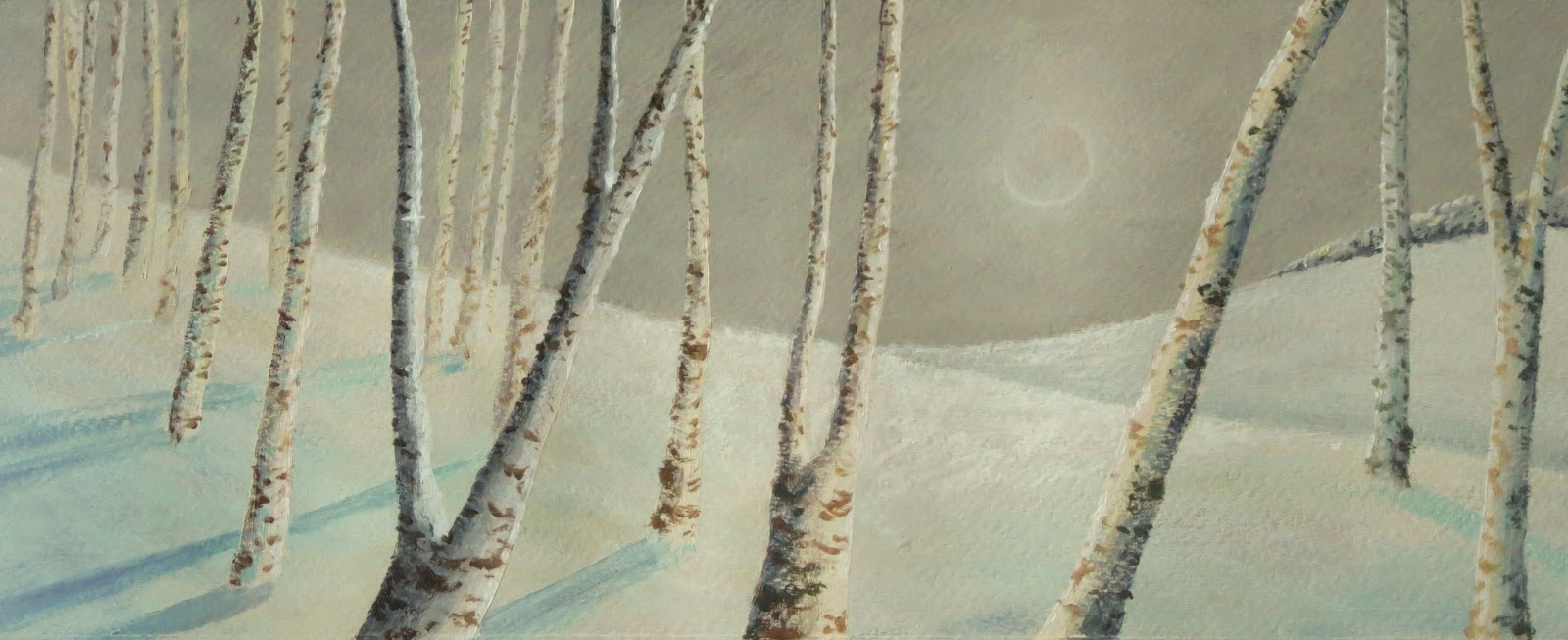
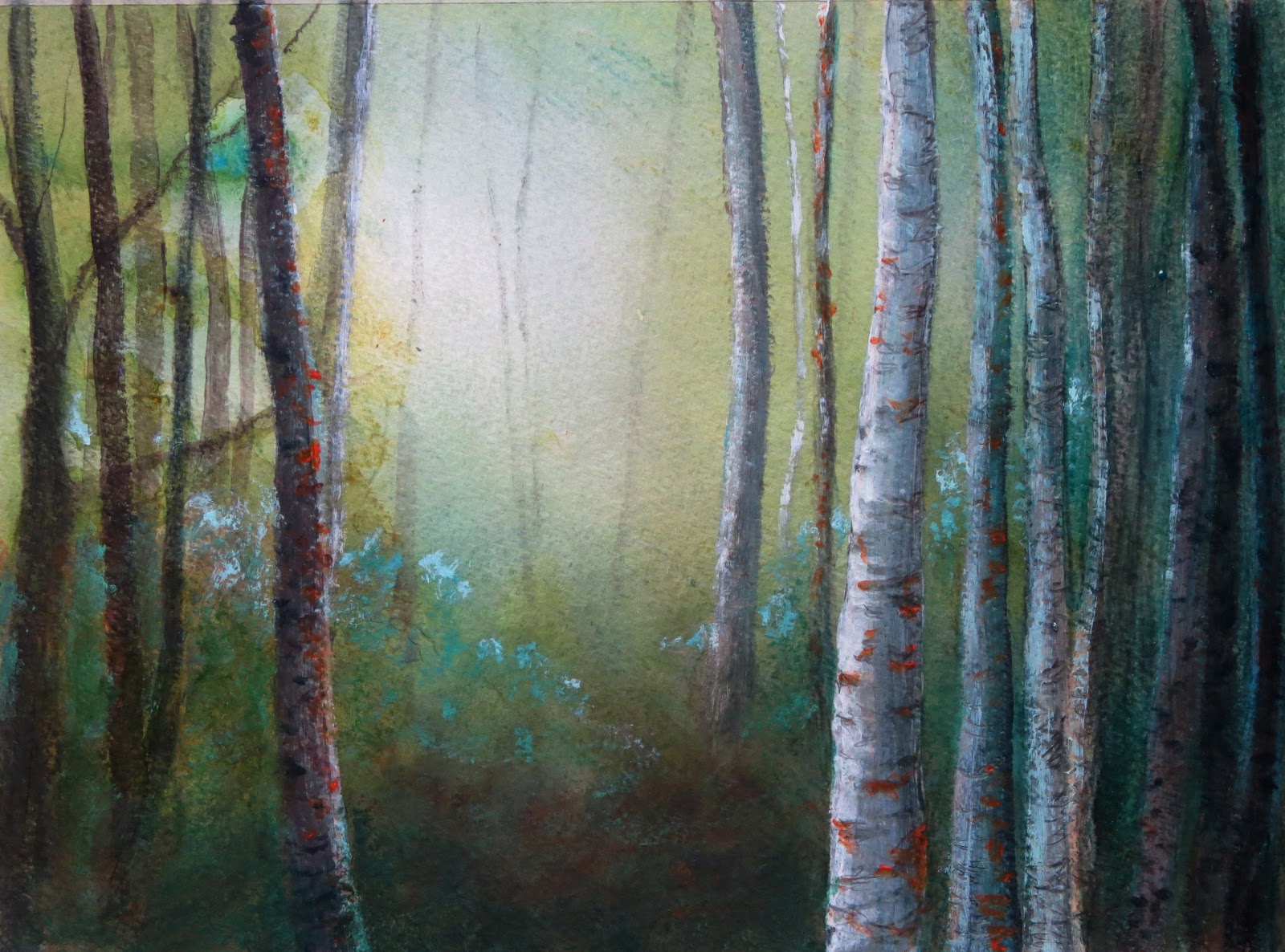
Wednesday 30 January 2013

Through the woods


Through the Woods   acrylic on paper   37x15cm   ©2013Lisa Le Quelenec


It feels strange to be posting a snowy painting today when outside the sun is shining. It's so beautiful and I feel like I'd nearly forgotten what it looked like.

Monday 28 January 2013

I've been Bubbled!


Poppy cards available at Red Bubble ©2013Lisa Le Quelenec


This weekend an exciting package arrived. I'd uploaded a selection of my images onto a site called Red Bubble  and the cards that I ordered arrived. I am very impressed with the quality and speed with which they came, they are better than I could have imagined. Cards and prints, both unframed and framed, are available. I will be adding to the collection over the coming months.


This also opens up new possibilities for my work as well and is giving me new food for thought. For a long time I have sketched with water-soluble pens, used collage and other materials whose longevity and stability I have considered dubious. This is fine when doing sketchbook work and experimenting but would, to me, be unethical to use if making work for sale. I want my collectors to have a product that isn't going to disappear off the page or canvas. However if the artwork is a reproduction print made with quality inks on archival paper and is guaranteed a lifespan then there is huge scope for indulging use of these materials and pushing new boundaries. Not to mention purely digitally created imagery. What an exciting world this has opened up!


cards available at Red Bubble ©2013Lisa Le Quelenec


Friday 25 January 2013

The silence of snow


The Silence of Snow   acrylic on paper 16x15cm   ©2013Lisa Le Quelenec

The sky always seems to look dark against the whiteness of the snow. The silence - it's deafening...

Tuesday 22 January 2013

Winter Woods adventures in linoprinting part 2


Winter Woods II   linoprint and coloured pencil 14x15cm   ©2013Lisa Le Quelenec

Two further experiments with the lino prints from the weekend adding in some colour with coloured pencil. Two different moods I think but still quite wintery. 

Winter Woods III   linoprint and coloured pencil 14x15cm   ©2013Lisa Le Quelenec


For some really IMPRESSIVE blog posts about linoprinting please visit Sherrie York's blog and read these posts;

link 1     link 2    link 3

This series is a real nailbiter of suspense. I can picture this fearless printmaker with nerves of steel zipping around her studio with a superhero cape flowing behind her.

Monday 21 January 2013

Winter woods - adventures in linoprinting part 1


Sketchbook page ©2013Lisa Le Quelenec


This weekend I thought I would try my hand at a linoprint, something I haven't done for a long time. I thought I would start small and simple and the birch trees seemed to me to be an ideal subject to give it a go. After doing a couple of quick pencil sketches to decide on the main shapes I got started.

I had a piece of lino but it was so old I wasn't sure if it would be too hard and crumbly to carve. Luckily it didn't seem to bad and I spent an hour or so happily cutting away. I was very excited when it came to proofing the block and mixed up a rich dark sepia colour from my prussian blue and burnt sienna. I printed a couple of copies and sat back to look.


1st proof
As giraffes


The image looked quite busy for it's small scale, I had over done it with the trees and needed to reduce the number. In passing His Nibbs commented that the trunks looked rather like giraffe necks. As you can see, whilst it was so busy, he had a point ;o)

Out came the cutting tools and I removed a few of the trunks to make a bit more space. The second proof was much more my intention. I think the extra space gives the eye a bit more room to find a path through the forest.


2nd proof


I started playing around with the ink colours mixing them and making graduated colours. I loved this soft smokey colour and settled on that printing up a small batch to experiment with further. The image feels wintery and rather topical whilst we shiver here in the UK. We have had a little snow in Dorset and it feels like we may be in with a chance for some more.


Winter woods linoprint 14x15cm ©2013Lisa Le Quelenec


Just a quick mention, this is the last week to see the exhibition 'Light Space Time' at the Red House Museum in Christchurch. The last day is Saturday. Due to the snowy weather, please do check with the museum for any changes to their opening times and please stay safe whilst traveling. To see the Red House Museum website and opening hours please click here .

Wednesday 16 January 2013

An experimental recipe for 'failed' work


 Take one failed ghost print (a second pressing of a monoprint with no re-inking) and add some coloured pencil.


Add a little more coloured pencil and a little more each time it will burnish the colours underneath building a nice patina of marks.

Add a few extra marks to suggest the patterns on the tree bark.

Crop.

Adjust contrasts a little by digital means.


Result: either a good starting point for a new painting or something that could be digitally printed as a finished piece. Of course it is very likely that this piece will be filed into a sketchbook where it will either mature resulting in a mellowed, full bodied and well thought out concept or it will be chucked out never to be seen again like yesterday's moldy bread. The jury is out.


Winter II monoprint & coloured pencil 16x19cm ©2013Lisa Le Quelenec


The proof of the pudding: Whilst I don't think this will end up as a digital print, I think the original is far to rough to scan well, I am intrigued by certain aspects. I really like the way in which the trunks run off the bottom of the page - they seem to disappear into a snowy foreground which is somewhat topical at the moment. (I saw at least two flakes fall this morning which is a bit of an event in my part of the world.)


For anyone interested below is the first print that came from the plate. I'm still trying to get to grips with getting the consistency of the new inks right for successful prints but I am having a lot of fun trying. I will have to put in another order for paper soon as I am really getting through it. Keeping things simple and thinking in very basic shapes and marks is the way forward I think for the moment.


Winter monoprint 24x17cm ©2013Lisa Le Quelenec

Sunday 13 January 2013

Birch tree monoprints


Three birch monoprints ©2013Lisa Le Quelenec

I'm still exploring this technique, I think it lends itself well to this linear subject and I like the way certain elements run outside the borders of the traditional rectangular frame. I think I will be exploring this more. The lovely thing about these kinds of experiments is that it is a very fast method of exploring ideas and generating new paths to tread. This will be a month well spent.

Friday 11 January 2013

Forest Gloaming complete WIP


(The first three stages of this painting can be seen here)


Forest Gloaming 21x28cm mixed media on paper  ©2013Lisa Le Quelenec


By the end of stage 3 I had a very cold painting. I wanted to bring back some warmth and a little more light into the piece and so scumbled some yellow ochre and zinc white to take the edge off the very blue greens. Neater yellow ochre in the foreground warmed up the forest floor and added to the sparkle of the more purple/blue greens. Overall I have kept the cool atmosphere and the warm ochre has only served to emphasise this. (For some reason when I photograph this painting the warm ochre has been exagerated, it's not quite as obvious looking in the painting and the whole thing is quite a lot lighter. The camera is emphasising a higher contrast than in real life.) Very gently, I have strengthened the trees that stand against the light they are barely there and are suggested with broken line.

Using a NOT watercolour paper has meant that the surface has more of a texture than I would normally use but has been advantageous with some of the media. I've rather enjoyed mixing it up a little and think I will do some more work exploring mixed media.

Thursday 10 January 2013

Going daffie!


From my daffodil sketchbook ©2009Lisa Le Quelenec


Two pages from near the beginning of my daffodil book, these studies are from 2009. I remember at the time I had just got a copy of   Composition: Understanding Line, Notan and Color by Arthur Wesley Dow. I would really recommend this book for exploring composition and design, it's one I refer back to time and again. I was struck by the connections between yesterday's post and these studies.


Watercolour and pencil sketch ©2013Lisa Le Quelenec
 

Wednesday 9 January 2013

Experimenting with monoprinting


monoprint


New toys! Don't you just love them? I've treated myself to some new printing inks. I have previously been using oil paint which works up to a point but I'm too impatient to wait for them to dry. These shiny new inks are Schmincke waterbased lino inks. I'm just starting with a few colours and I haven't got any transparency medium as I am hoping that some of the screen printing medium that I have already will suffice. Fingers crossed as I have a huge tub of it. The colours that I chose were titanium white, indian yellow, vermillion red (just a small tube as I don't use red too often), cyan, prussian blue and burnt sienna.


monoprint with added ink, coloured pencil and watercolour


I inked up some of the vermillion red and indian yellow and got stuck in. Firey hot colours for the grey day that we are having. A quick line drawing to loosen up. I love the soft diffused line of this technique. The inks are much, much more fluid than I was expecting, I thought they would be tackier so I think they will take a little time to get used to.


Once the ink was dry I thought I would work into the print with some other media. This experiment could well be a starting point for a painting in the future. Whilst I wouldn't say I was happy with all aspects, particularly the colours, there are elements that could be experimented with further. The soft fluid character of line that you get with monoprint and the diffused texture is interesting. It's also reminded me how I like to work with more graphic imagery sometimes. I'm starting to really enjoy this month on experimenting.


Friday 4 January 2013

Sketchbook page - daffodils


                                     Daffodil sketchbook page A4 ©2013Lisa Le Quelenec                                      


I know that I am jumping the gun a bit as it will be a while until spring but I couldn't resist! His Nibbs added a surprise to my studio - a beautiful bunch of early daffodils.  They are my favourite, a splash of cheerful yellow to brighten up the grey of winter. A reminder of the warmer, brighter months to come.

Out came my daffodil project book which I didn't think I would be using so early in the year. Every year I add to the sketches and studies, a project that came about because I had a problem with painting yellow. Bit by bit I overcame the issue as I learnt to utilise the other colours in the palette to emphasize the yellow-ness of the blooms. To see a couple of pages from last years daffodil studies click here.

It is fitting to be using this sketchbook to develop the experimental theme I'm exploring this month. I've used fibre tipped pens, inktense, derwent watersoluble graphite and watercolour on this page after thoroughly dampening the paper before starting to draw. (except where the fibre tipped pen is, for that one I wet the paper after with a brush)

I really like the softened line that the watersoluble pencils give on damp paper, it makes me think of linear monoprints. Maybe I should 'play' with that technique next?


Wednesday 2 January 2013

A new year and a new WIP


stage 1
stage 2

Happy New Year!

I hope everyone had a lovely time this holiday season. I've had a lovely break and feel raring to go. 


With no pressing deadlines coming up in January I have decided to take a little time out for experimenting and play. During December and most of November I had so many ideas flitting around my head and not enough time to explore so I'm rather looking forward to this month. January is still so cold and dark and feels decidedly flat after the glitz, sparkle and excitement of December what better way to cheer up the month than to hole up in the studio and play.


In the spirit of experimentation I thought I'd start this years posts by sharing a wip. This piece has been inspired by a walk in the New Forest, I wanted to capture the feeling of walking through the dense trees, their thick canopy overhead, into the bright light of a clearing. The word that kept coming to mind on this particular day was 'gloaming'. Whilst not strictly correct the lack of light in the thick of the forest can often feel like dusk.


Stage 1 - I began with a quick pencil drawing lightly plotting the shapes of the trunks and then adding oil pastel to this which would act as a resist to the watercolour layer that was to come. I scratched back into the oil pastel with a sharp pencil adding in the markings on the birch trunks. The watercolour stage was rather fun, soaking the paper and adding lots of dilute paint, tilting the board and letting gravity have it's way, encouraging back runs. Whilst the paper was still very wet I added some trunks very lightly with the side of a pencil. The extra pressure on the paper was sufficient to give a subtle tone indicating but not over stating the trees presence against the brightest light.


Stage 2 - Building up the trunks with a mixture of coloured pencil and acrylic. I scratched into wet and dry paint enjoying making marks and building up the darker tones, adding in highlights here and there. Then I took stock - the painting felt a little too warm and didn't have the cool and damp feeling that I associate with the forest, I need to shift the colour temperature. Also the left hand side needed more trees to counterbalance the weight on the right.


Stage 3 - More trunks but with less detail on the left, I made these darker in tone to balance the weight on the right. I added light glazes of a phthalo turquoise mix to cool down the temperature which got progressively stronger towards the right away from the light source into the denser trees. With a dry brush and acrylic paint I've added the suggestion of foliage from the forest floor. Finally to contrast against the cool blue greens I've added light touches of cadmium orange (I was feeling reckless, I wouldn't normally use this colour but it felt 'right' in this painting.) I'm leaving this piece here and will return to it next week with fresh eyes.


Stage 3 Forest Gloaming 21x28cm mixed media on paper  ©2013Lisa Le Quelenec